Making Websites
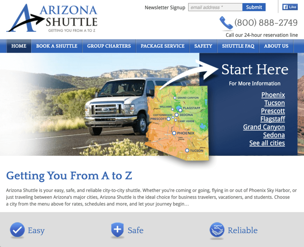
A New Website Drives Reservations for Arizona Shuttle
Arizona Shuttle operates between Arizona’s top vacation destinations and Phoenix Sky Harbor airport. To help them position themselves against a popular local shuttle, as well as to compete against several smaller van services in some of their destination cities, we worked with fp2 Marketing to design a new logo, write a tagline, design van graphics,…
Read MoreSeven Tips for Writing for Websites
Writing for websites is different from writing for print media. Numerous usability and eye tracking studies have shown that website visitors skim and click. They don’t read thoroughly or linearly. To draw users into your text and to improve your site’s “skim-ability,” use these well-documented tips: Get to the Point – Site visitors have a…
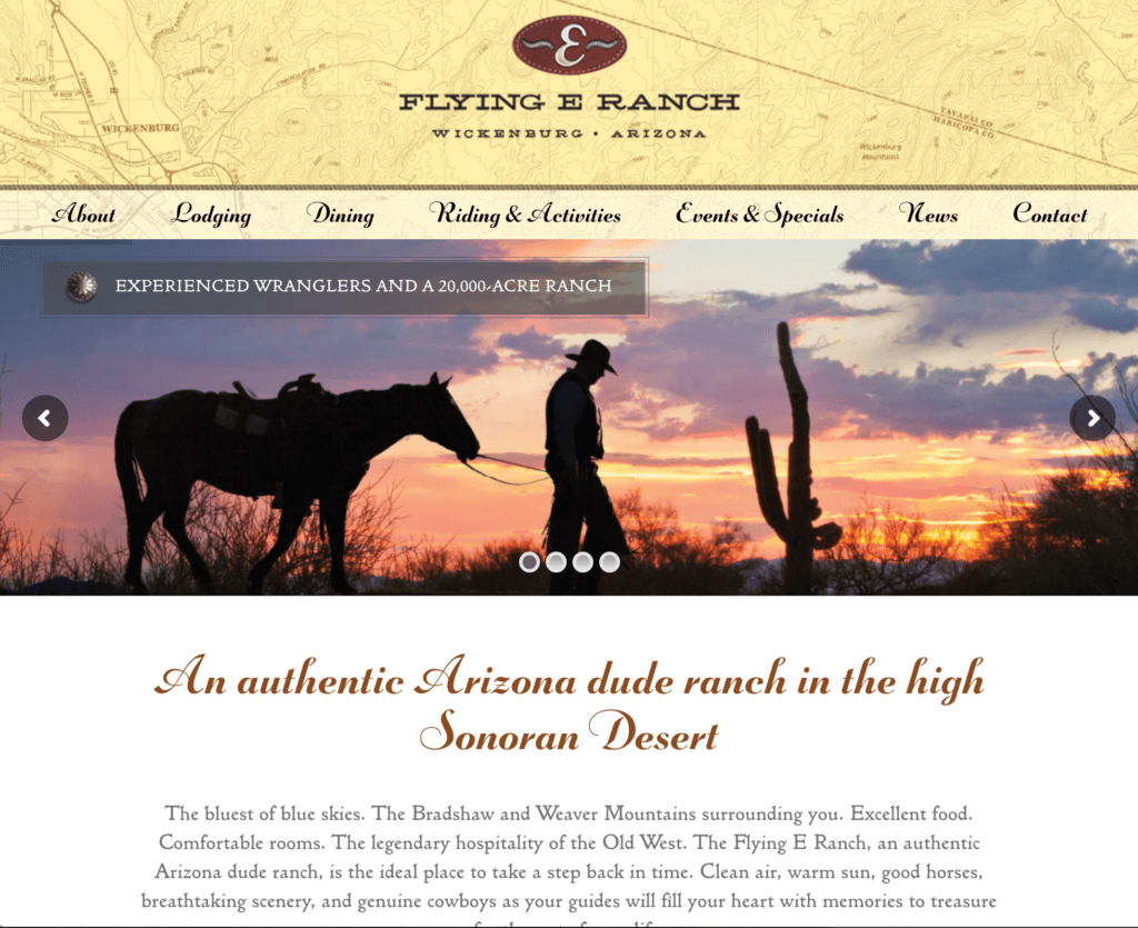
Read MoreFlying E Ranch Hits the Trail with New Website
This dude ranch in Wickenburg, Arizona, needed a website upgrade to coincide with improvements they were making to the property. Working with Ember Design for visuals, we planned and developed a full-featured website that showcases the attraction and charm of the Flying E, including its setting, its activities, and its lodging options. Features include a…
Read MoreEasy Checks for a Mobile-Friendly Website
In April, Google updated its search algorithm—the list of weighted criteria that Google considers to determine the order in which it will rank websites on search results pages. The core of this update was to give a search boost to sites that are mobile friendly. In short, if your website doesn’t work well on mobile devices,…
Read MoreWebsite Design for Cannext Lab Passes with High Marks
Cannext laboratories, located in Phoenix and Las Vegas, provide medical cannabis testing services for cannabis dispensaries and patients. Eight Trails designed and developed a modern, fully responsive website that communicated the company’s professionalism through words and images.
Read MoreDon’t Let I.T. Run Your Website Project
I got a note from a prospect the other day saying, roughly, “We don’t think we need a site architect. Our IT department is going to work with our designer.” Yikes. That short exchange raises so many concerns. I’ll start with the last one first.
Read MoreTweaking for Dollars
I just finished reading Steve Krug’s latest book, Rocket Surgery Made Easy, and was particularly struck by his suggestion that you tweak your website rather than redesigning it. In fact, one of his usability testing maxims is “When fixing problems, always do the least you can do.” “Do the least you can do” isn’t a…
Read MoreHarnessing the White Elephant – Put Your Website to Work
Why do we call the gift that keeps on re-gifting a “white elephant”? The answer may surprise you, and along the way it offers a valuable lesson about productivity for your website. It’s Good to Be the King (or His Pet) In the lands where such beasts could be found — India, Sri Lanka, Siam,…
Read More10 Questions to Ask About Your Website
Have you ever seen the infomercial for the Ronco Rotisserie? Ron Popeil up there on stage wearing his apron and a big grin, roasting a chicken and leading the studio audience in shouting his product’s tagline — “Just set it…and FORGET IT!” Ron Popeil is an American marketing legend (Veg-o-Matic, Popeil Pocket Fisherman, Mr. Microphone),…
Read MoreDesign Your Website for the People Who Use It
(This article originally appeared in a slightly different form in Southwest Graphics, Fall 2007) One of the most common requests we receive from our clients is to include an FAQ section on their website. Despite the frequent requests for FAQs, we rarely put one on the sites we build. Why not? Because your entire website…
Read More


